Energy & Utilities Alliance (EUA)

Challenge

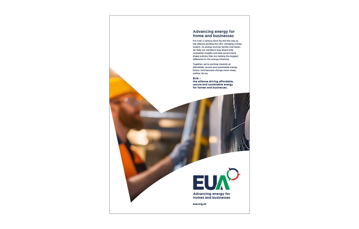
EUA needed to future proof a century old alliance whose legacy structure (multiple standalone division brands) no longer matched the changing energy landscape.

The brief was to define a single, growth ready industry territory, unite members under one clear vision and create a modern identity that communicates EUA’s public purpose: solving the energy trilemma for homes and businesses.

Our approach
  • Strategic diagnosis – Mapped external pressures (decarbonisation, technology change, policy priorities) and internal fragmentation to identify the strategic “killer questions” that would shape the repositioning.
  • Category definition – Reframed the organisation’s remit from “Energy & Utilities” to Energy for homes and businesses, creating a future proof industry definition that spans upstream and downstream members.
  • Membership alignment – Redesigned the brand architecture so all members belong to EUA via six specialist groups, preserving governance while clarifying two tiers of benefits: alliance (public/government) and specialist (sector specific).
  • Creative articulation – Developed a refreshed logotype, a colour accented “A” and a three segment symbol that embodies interconnected strength, forward motion and the energy trilemma. The symbol is formed of three interlocking segments, each shaped with arrowheads to inject a sense of motion and advancement.
  • Highly collaborative delivery – Worked through a cross member working group, regular board stakeholder meetings and iterative board sign offs to secure buy in at every stage and ensure the repositioning reflected member needs and governance realities.
What we delivered
  • Positioning strategy: Vision, industry definition, membership offer and transition roadmap.
  • Brand identity: Modernised logotype, new symbol, colour system and a clear rule for “Part of EUA” specialist group lockups.
  • Relaunch assets: Key messaging, brand story, advert concept and a relaunch strategy to guide web, member and stakeholder communications.
  • Governance friendly rollout: A staged transition plan so members keep existing governance and services while language and visual identity shift to unite the alliance.
Impact & outcomes
  • Clarity for members and government – EUA now speaks with one voice about affordability, security and sustainability for buildings, making policy engagement more coherent and persuasive.
  • Stronger recruitment and growth potential – The specialist group model makes it easier to attract adjacent member types without creating new standalone brands.
  • A purposeful identity – The new identity is not cosmetic: it was designed to express EUA’s role in “driving affordable, secure, sustainable energy for homes and businesses.”
Services
  • Strategic review
  • Brand positioning
  • Brand articulation
  • Logo
  • Strapline and visual identity
  • Relaunch assets
Results

EUA will be tracking stakeholder buy in, member engagement and growth and commercial outcomes to show advocacy impact and tangible value.

quotemark
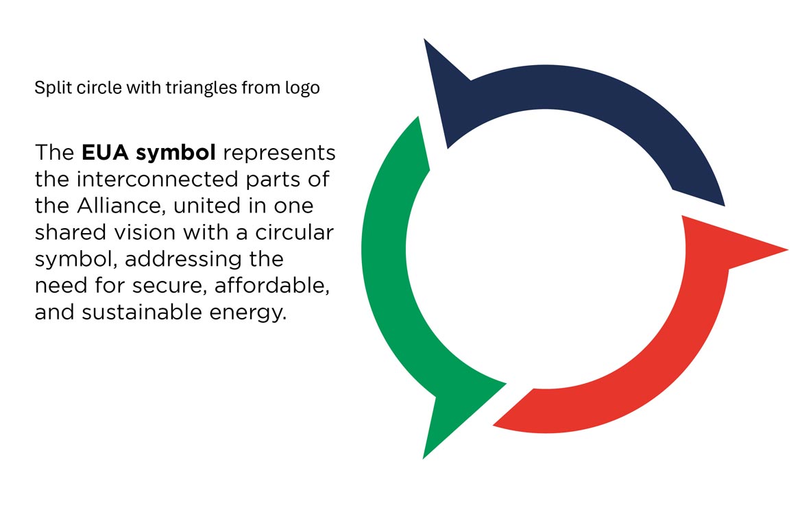
This refresh isn’t about a shiny new logo for the sake of it. … Those three segments represent exactly what we stand for: interconnected strength, forward motion, and our relentless focus on tackling the energy trilemma.
CMDi helped us evolve our brand with great clarity, so that it reflects who we are now and the role we need to play as we help advance energy for homes and businesses.

Mike Foster, CEO, EUA